
#173F8APrimary CTAs, active states
ID
IndyDTF UI Library
IndyDTF Design System
A permanent showroom for storefront, studio, and production UI.
A premium component reference for the future IndyDTF website: product commerce, design tools, forms, overlays, dashboards, and responsive behavior.
5Brand colors
8Action states
3Responsive tiers
1. Foundation
Color Palette
Indiana flag-inspired blue and gold anchor the UI, with red reserved for critical states.
Swatches show token, hex, and intended usage.
2. Typography
Typography
Scaled hierarchy for marketing, commerce, tools, and admin panels.
Hero heading for high-confidence ecommerce screens.
Section heading for catalog and design studio pages.
Panel heading for builder controls and checkout cards.
Compact heading for product cards, rows, and status modules.
Body copy stays practical and readable. The system should feel modern, but it should still work for repeated production tasks and dense commerce decisions.
Helper text supports constraints, metadata, validation, and subtle operational notes.
Marketing density
For premium landing pages, hero sections, brand storytelling, and trust-building copy.
Commerce density
For product grids, pricing, badges, filters, and scannable catalog decisions.
Studio density
For toolbars, panels, measurement controls, production metadata, and workspace-heavy screens.
3. Components
Buttons And Actions
Grouped by reusable intent, including loading, disabled, icons, and close controls.
4. Components
Tabs
Shared tab primitive for product information, measurement, studio, and admin surfaces.
Product Overview
Use tabs when related content belongs in one section but customers need a clear way to switch between focused views.
Additional Information
Panels can contain tables, product metadata, forms, or composed domain content without changing the shared tab primitive.
Measurement Content
Future measurement tabs should render Measurement Engine content inside this shared surface instead of recreating tab styling.
The active tab uses color, border, surface, and a gold underline so state is not communicated by color alone.
Hover and focus states use the shared focus ring and root color tokens.
Keyboard users can move with Left, Right, Home, and End while the controller updates ARIA state.
On narrow screens, the tab list scrolls horizontally inside itself to avoid page-level overflow.
Disabled tabs are skipped by keyboard navigation and cannot be activated.
5. Layout
Cards And Responsive Grids
Desktop columns collapse at tablet and mobile breakpoints.
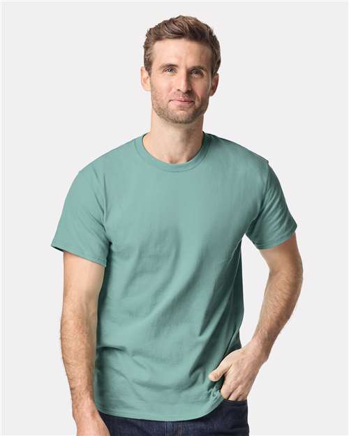
Two Column Layout
Product-led storytelling for shop and service pages.
Use this pattern for category intros, checkout education, production explainers, and builder entry screens with real apparel imagery.
A
Apparel Customization
Product-first path for garment, color, size, placement, and print area decisions.
G
Gang Sheets
Separate ready-upload and design-layout workflows, shown here as visual concepts only.
S
Single Transfers
Simple order flow pattern for standalone DTF transfers and repeat ordering.
1
T-Shirts
High-volume catalog category.
2
Hoodies
Cold-season product group.
3
Transfers
Fast repeat purchase surface.
4
Production
Admin and print queue modules.
6. Full Width
Full Width / Campaign Layouts
Shared layout primitives for merchandising, studio surfaces, and dashboard-width experiences.
Container usage rule
Full-width sections span the browser width, while inner content remains aligned to the wide container. Full-width sections are reserved for high-impact merchandising, studio workspaces, gang sheet layouts, and admin dashboards. Standard content should use the normal container.
Wide container
Permanent wide content rhythm for standard website sections.
Use this width for product education, checkout forms, account pages, content blocks, and any section where reading and decision-making matter more than spectacle.
C
Commerce
Catalog and buying flows.
S
Support
Help and proofing content.
A
Account
Customer order surfaces.
Wide container
Reuse product card rules
Wide merchandising grid for high-density product/category browsing.
Apparel
Premium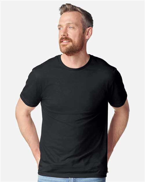
Transfers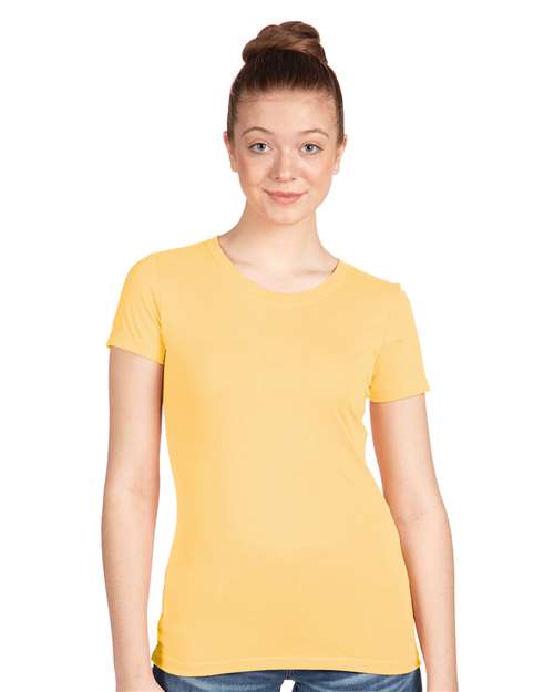
Studio Entry
Single Transfers
Simple production-ready entry for standalone DTF work.
Fast quotesCatalog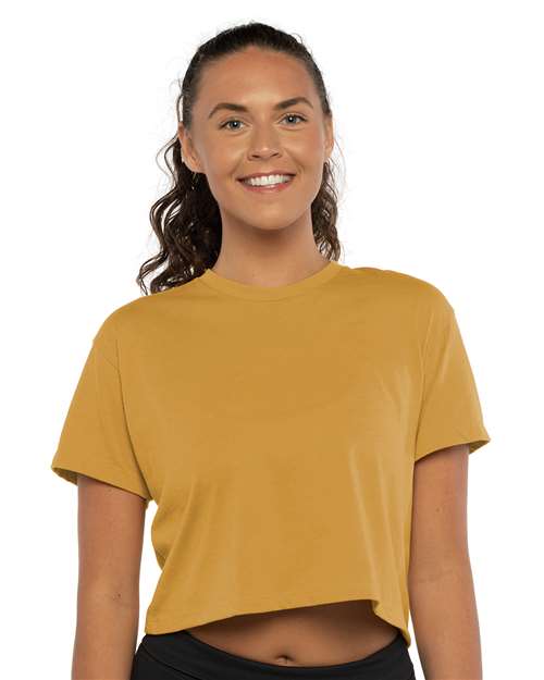
Shop Category
Blank Apparel
WooCommerce-sourced products ready for future workflows.
Browse catalogFull-width campaign hero
Merch drops, school spirit, and high-volume print campaigns.
Use full-bleed blue and gold moments sparingly for pages that need immediate merchandising impact without leaving the IndyDTF design language.
Amazon-style feature
Build a store-ready apparel campaign.
Large feature tile for seasonal collections, local teams, and creator merchandise.
7. Commerce
Product Cards
Realistic product cards for WooCommerce catalog and builder entry points.
Best Seller
Premium
Popular
Jerzees
From $18.75
Crewneck Sweatshirt
Clean midweight blank for front and back prints.
Youth
New
Bella Canvas
From $10.25
Retail Fit Tee
Modern fit blank for brands, creators, and premium merch.
Team
Sport-Tek
From $28.00
Performance Hoodie
Athletic layer for schools, teams, and event staff.
Soft
Comfort Colors
From $22.40
Garment Dyed Crew
Retail-inspired sweatshirt with a soft lived-in finish.
Value
Port & Company
From $6.95
Core Cotton Tee
Reliable everyday blank for volume orders and promos.
8. Inputs
Form Controls
Controls shown inside a reusable form card, including validation and upload states.
9. Dropdowns
Native Selects
Native selects are the default IndyDTF dropdown pattern. Custom dropdowns require approval.
10. Overlays
Modal And Drawer Examples
Static previews using shared surface and close-button styles.
Proof Preview
Backend render pending
A compact confirmation surface for preview, approval, or upload status.
11. Studio
Design Studio Mock
Visual-only mock: no real Print on Apparel or Gang Sheet logic.
12. Admin
Production And Catalog Operations
Clean, scannable admin patterns for production teams.
Production Queue
Catalog Health
Woo SourceAdmin surfaces should stay dense, scannable, and quiet.
Woo products synced24
Variations ready312
Images mapped96%
Feed readinessDraft


